12.04.2009

Packaging!

I'm having so much fun packaging my stationary. It's one more opportunity to design something creative. I like the "designing" part of this the most. Too bad it makes the postage so much more expensive. I haven't offered the "gift wrapping" to my customers on Etsy as of yet because it bumps the shipping cost to more than double (from $2 to $5) and it does cut into my "profit" on each set... It just seems silly to me to ask $5 to ship an item that cost the buyer only $10!
In any event, when I have the supplies handy, I do enjoy having some fun with the packaging.
The Bee Silhouette here is embellished with a Swarovski crystal.
It corresponds with the Bee stationary inside.
I love the way this pillow box turned out with the ribbon and fleur-de-lis together!
Though difficult to see in this picture, the image of the tree is shadowed in chartreuse. The envelopes for this set are also chartreuse.
The red crest is enlarged for this box top and layered with the ivory linen card stock used for the stationary set inside. The set comes with red envelopes.

10.25.2009

The Bella

One of my best "customers" is also a good friend. She is the kind of person that says, "Would you make an order for me? The little girl likes horses." I love that... the perfect amount of "direction" with the majority of the creative freedom left to me.

I wanted to do something special for her daughter who is having a birthday soon. Usually, Bella is giving the cards to her friends as gifts but this time it's Bella's turn for a set--from me.

Here's what I labored over:
It's a horizontal folded card on ivory cardstock. The scalloped circle is cut from an "apple green" linen-textured card. The top coin (with the daisy image) is the same ivory as the base. The gingham ribbon is black and cream which really works well with the bug. The envelopes are a great way to pull the set together.
Here is a close-up of the graphic:
I really fell in love with these cards. I am so happy they are going to such a sweet girl! The work involved in making a set like this is time-consuming. In order to make a decent profit on selling this design, I would have to charge what I consider "too much" money. So I modified the card to the style I use more often. It is a simple flat note that can be personalized and purchased for a much more reasonable cost:
I added this graphic of a simple daisy to the sides of the name at the foot of the card:
And here's a close-up of it:
I think the simplified flat note is a good representation of the original, more detailed version.
What do you think?
Look for "The Bella" card to hit the Etsy shop very soon!

9.23.2009

LOOK, LOOK, LOOK! ------------>

The PiperSimone Paper store is finally on Etsy.com! It took some time to figure everything out... but it's a great first step. I hope to get the "shop" up to the high standards I hold for myself sometime soon. Between potty-training, preschool, parenting, blogging, crafting, etc... (!!!) it will happen. (Nothing like a little positive self-affirmation!)

8.26.2009

Safari Shower

My cousin is having her first baby in a couple months. A new baby boy to kiss and cuddle and squeeze. I'm so excited. I made these little cards for her to celebrate her Monkeyboy.
The cards are a flat note on linen cardstock. The big image above is just the cover of the gift box I made.
For her baby shower, I made a version of "Helpful Hint" cards I had seen online. Here is where shower guests can give advice to the new mom and dad-to-be.
I also made a little pillow box to keep the advice cards organized.
And lastly, a few sweet bookplates for the little booger.
;)

7.15.2009

Invitations Invitations!

A friend of mine asked me to come up with a few designs for a Bridal Luncheon and Bachelorette Party she is hosting for her cousin.
It was a great excuse to make some samples for my book.
(above) A simple and elegant luncheon invite with black scroll detail along the bottom.
(above) This is a fun summer theme for either a bridal luncheon, shower, or bachelorette outing. The lime and tangerine colors really pop on the white cardstock and the green envelope is a nice addition.
(above) Cherry blossoms are a favorite of mine. I found this great graphic of tiny white blossoms in a salmon background. Once I added the clip to the invite it looked a little "bottom-heavy" so I popped on a couple salmon stripes at the top to help balance the card.
(above) In the sample for my friend, this card is a bachelorette invite. Here I've made it a dinner and cocktail event for both bachelor and bachelorette. Duel parties are becoming more and more popular and this would be useful as a rehearsal dinner invite or dinner party as well.
(above) I think this card turned out so fun! I love the pink with the green--and who doesn't appreciate a nice cocktail with a lime wheel garnish? Great for the bachelorette party, a cocktail party, or a 21st birthday celebration.
And last but not least, the invitations I made for my sweet girl who turned 4 this last weekend! The red ladybug is a punch atop a scalloped circle nestability punch.
We gave her a "Bugs in the Garden" backyard birthday bash. If you want to see more details on how that turned out, visit our family blog here.

6.29.2009

Pillow Boxed Thank You's

I made these awhile ago and plan to send them as thank-you gifts this week to the friends and family who hosted us when we were in California so I thought I should take a picture to show you!
This is a set of folded notes with ribbon, paper, and fabric flower embellishments. The card base is white linen cardstock and the envelopes are kraft paper. The box is one I bought and decorated to coordinate with the card set.
This is a set I made from recycling my calendar (I've used a few pages to make card sets and pillow boxes. You can see another here at my "family blog"). I punched a circle out of the patterned part of the calendar page and added a white punched-dove to each card. All of the cards are slightly different and they fold on the horizontal.

6.28.2009

I Know Why the Caged Bird Sings

... Because she's so pretty!
Here's a box of notes I made for a recent order.
It's a flat note on white linen card stock.
The font for the text was inspired by an old-fashioned typewriter.
The stamp is one I've had and you might recognize a smaller scanned version from our Halloween cards last year.
This time, I embossed the stamp:
I really like the way these cards turned out.

6.17.2009

Beautiful Blue

These swirly folded notes turned out so well!
My friend Shaley actually designed them... she just got married (congratulations, again!) and wanted some simple notes to send as thank-you's. 
She described the style and "look" of the cards she had in mind, then I made several "samples" for her to choose from.
Within the scrolled stamp is a crystal glitter embellishment.
The box was sweet too!

6.05.2009

Coin Invitations

A few of my girlfriends are expecting their first babies right now. It's always so exciting for me to see my friends go through the amazing experience of making a baby.
Here's an invitation that was inspired by my friend Amy who is expecting twins.
The coins are punched from kraft paper (like a brown paper bag) and affixed to a flat card.
Here's the same idea in a different layout with a green accent color.
And of course, I needed a pink representation.
The punch for this elephant actually as a little raised ear (very sweet).

6.03.2009

Embossing--Who Knew?

Who knew how much fun embossing could be?
The thing with embossing, is that you have to work from stamps. Stamps are tricky... if you're a perfectionist like I am. The ink has to be just right; the pressure needs to be "even" for a clean mark; the placement can be off with wood blocks if you're not careful... But aside from all that--it really is fun!
Here is a simple horizontal flat card.
The stem and chick were in the same stamp set that I had purchased recently.
Embossing involves several steps and can be time-consuming; however, I think the result is worth the effort. 
Here's a close-up:
The process results in the pigment becoming glossy and rising from the paper.
Here are a few I did with a stamp that was more "substantial" when pressed.
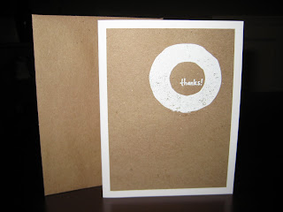
The card is a vertical fold; kraft paper on heavy white cardstock with a kraft envelope.
Obviously, the stamp and embossing has been done in white.
Here's a close-up to show the texture of the printing when the process is finished.
I liked the white set so much I followed the same format to create a chocolate embossing on "natural" cardstock (vertical fold) with a chocolate envelope and pink embossing on white cardstock (horizontal fold) with a pink envelope.

Oh my... now that I have this new crafty way to spend my free time... I wonder just how high my laundry pile will get?

6.01.2009

New Invitation Ideas

I'm participating in an "Opportunity Party" this weekend and trying to figure out how to market what I do. Usually, I make gifts with my cards and occasionally I make a gift of invitations for my friends. Here are some "sample" invitations I made for the event to give folks a little idea of what I can do.
Caterpillar
(with complimentary green envelope)
Pink Cupcake Cloud
(with chocolate text and corresponding chocolate envelope)
Rocket Ship
(with green envelope)
Classic Car
(on natural cardstock, rather than white)

All the cards are flat A2 size (4.25 x 5.5).

5.20.2009

On the Fly

Here's a card I put together on the fly. It's just like me to make cards as my passion and yet to not have one to accompany a gift (typically cards) that I'm giving!
I just made one of these. It's a folded card: pink card stock (rounded corners), green scalloped square, and a tiny pink and cream silk flower fastened with a green "button" brad. I could easily see this card personalized in a set with a name or "Thank You" printed or stamped. Of course, plain is quite nice too! The envelope is white with a matching pink scroll stamped along the edge.

Happy 4th Birthday!

Geneva (my 3-year old) was invited to her first "Chucky Cheese" birthday party a couple weeks ago. Wow. She was excited and overwhelmed. It was great!
The base is pink card stock (horizontal fold).
It's embellished with a green scalloped circle under the butterfly graphic circle.
The card is finished with a black satin ribbon.
This set I put together with matching pink envelopes and the storage box (right).

Preschool Cards

These were also done during "Teacher Appreciation" week.
I put this simple design together for the Director, Teacher Michelle.

5.06.2009

Teacher Appreciation Day III

These are for Geneva's primary teacher at school, Teacher Jessica.
The cards are in the stack on the left; the gift box I made is on the right.
I used some nestibilities in the scalloped circles to make the center cutouts. The white circle is punched through the middle with the apple so the red circle shows through the center.
The green ribbon and text were not quite enough...
... so I added some green dots to the scallops. They don't show up very well in the photo, but I think the overall effect is really cute.

Teacher Appreciation Day II

These are some simple cards I have made in the past that turned out really well. I have a set that I made for myself.
These are for the teacher that does all the wonderful, organic cooking at Geneva's preschool.
The graphic is another clip art. I added her name in chocolate brown script and paired it with brown envelopes.
Somewhere along the way, I picked up some gold pear seals.

Teacher Appreciation Day

My 3-year old is in preschool. 
She has several "teachers" depending on the situation.
These are some flat cards I made for her music teacher.
The graphic is clip art and the text reads:
"A little 'note' from Teacher Kara"
Here's a close-up of the graphic.
I decided to do two cards in each of the colors that were represented in the graphic by mounting the white card stock to separate sheets of colored card stock with matching envelopes.